

 The use of mobile devices to connect to the internet was always a tiny percentage of the desktop and laptop users for many years. With the advent of smartphones with screen sizes rising above 3 inches, broadband internet and 3G mobile connectivity, the picture for mobile users has changed dramatically over the past 2-3 years. As coverage expands with 4G LTE networks in the UK, faster access speeds will only accelerate the expectation of users for mobile-ready websites.
Depending on which survey you examine, traffic to the typical website is now coming 50% from desktop and laptop users, and the other 50% originating from mobile users accessing the internet on their smartphone or tablet, or both. This changing situation has caught many small businesses by surprise. They invested in a website several years ago that looked fine on a 10-inch or larger display, but is completely unusable on a smaller screen size.
Mobile Sites Need To Modify Their Content
Reading content on smaller devices with smaller screen sizes means paragraphs need to be shorter too. Bite-sizes pieces of content is a better idea than offering lengthy paragraphs that one might see in a book. With a smaller device, one long paragraph could take up the whole screen or more, and put off the visitor from sticking around to read the content.
This situation is still true as users move to phablet-sized smartphones in the 5-inch to 6-inch screen size range, but less so with tablets. Readers on the web like to scan, rather than read a complete article, which is why shorter paragraphs and more headings within each article make sense.
For existing sites, content needs to be re-written to make it easier to view and digest in smaller chunks. Paragraphs should be cut in half, points simplified, and more sub-headings included. Wherever possible, adding bullet points or numbered lists to make content more scan-able is a good idea. Different forms of media like video content, slideshows, and infographics helps to create a more visual and auditory experience which can widen the appeal of the ideas being presented.
Off The Peg Design can help with each of these aspects to transform existing content into something more accessible for a mobile audience.
Design Changes Required for Mobile Sites
Sites need to be redesigned or replaced with a new appearance to make them responsive. Responsive design approaches lets the layout of the website adjust intelligently to the size of the screen the device is being viewed on.
This could require changes like using a sticky header that slims the larger header down to one with minimal navigation and a smaller logo, to allow more screen real estate for the actual content to be shown.
Some on-screen elements can be stripped away or simplified to make the site easier to access on a mobile device. A navigational button can be included in the header instead of using a substantial navigational bar that takes up a lot of space. One tap on the navigational button and it can expand out to let the mobile visitor select the section of the site that they’re looking for.
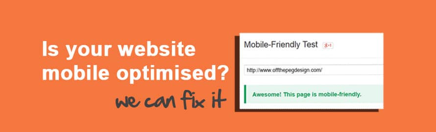
Google Has A Tool To Check A Site For Mobile Access
Google takes mobile access seriously because it sees directly how many of its users are accessing their search engine on a mobile device and where they’re sending this mobile traffic.
The search giant released a free tool to look at an existing website and confirm which pages are mobile-optimised and which are not. If you’re in any doubt, don’t take our word for it, open up a separate window and check the site with the Google mobile accessibility tool.
 UK Surveys Confirm What UK Businesses & Consumers Want
Almost a year ago, a report by IMRG in February 2015 confirmed that 45% of all e-commerce traffic was originating from mobile devices. This number grew throughout last year and is only likely to continue.
According to VoucherCodes.co.uk and the Centre for Retail Research, UK business is losing £6.6 billion annually due to not having websites optimised for mobile users
The loss of revenue due to not offering a fully-optimised web experience for mobile users across all internet devices is a key point and applies equally whether this is for Millennials or pensioners. In the case of Millennials, they’re much more likely not to deal with a company when they’re unable to do business with them online using a mobile device.
Perhaps surprisingly, so high is the expectation of the younger internet generation of being able to do business online, on any connected device, that businesses can receive damaging customer reviews purely because they’re not completely ready to meet the customer where they are to get the sale and manage the transaction’s progress entirely online.
 Where To Go From Here?
 Where To Go From Here?
Whether your business has an existing site that needs to be optimised for mobile access through a design and content refresh or you now know that you need a complete online overhaul, we are here to help you.
"*" indicates required fields
Off The Peg Design has considerable experience helping clients realise their switch to a mobile-centric online presence that will be perfectly positioned to benefit from an increased level of interest and sales from customers accessing the site on many different devices.